[ny] designlab: poster design
client: clearwater 2009
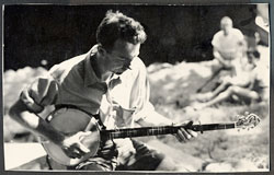
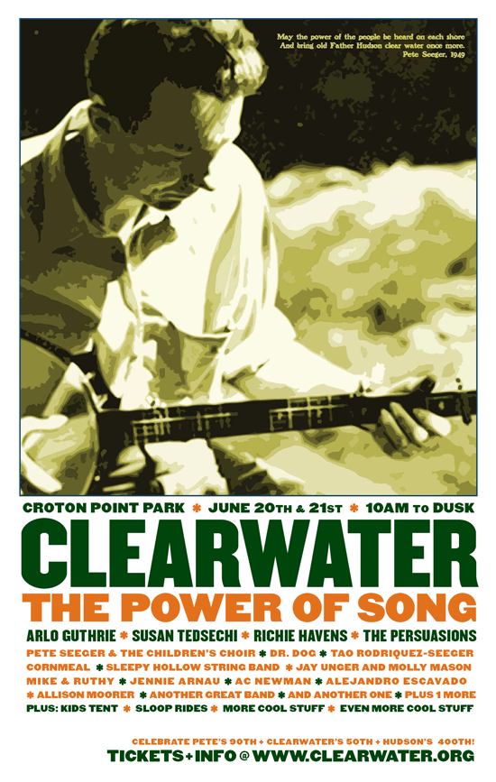
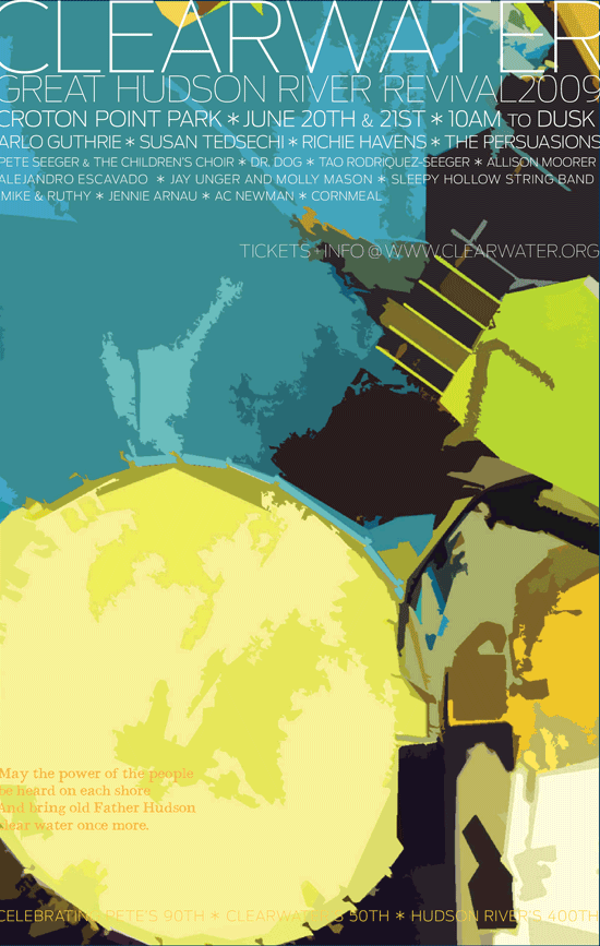
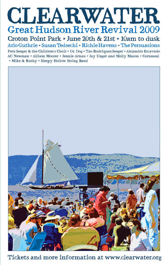
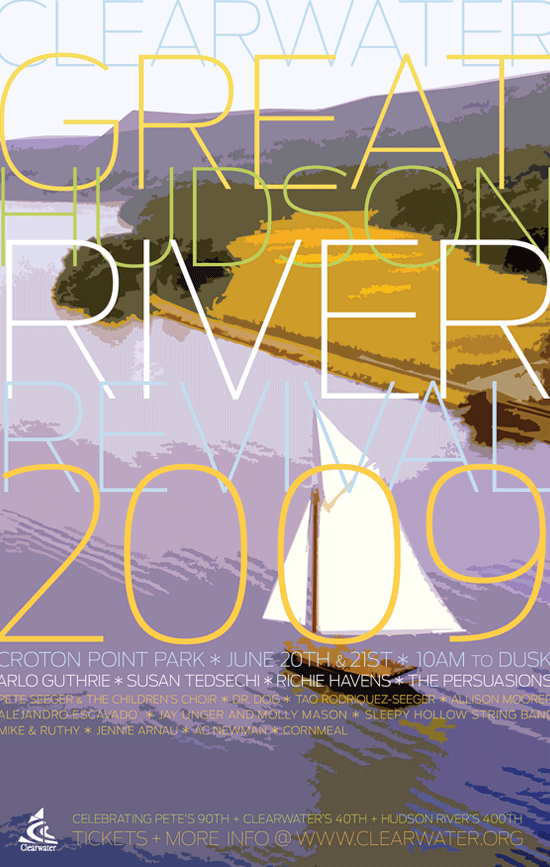
[Designer’s comment] These posters were done as part of an overall event marketing package for the 2009 Clearwater’s Festival. The final image, adapted by NYDL and used throughout all of their festival marketing that year is the first at right, known as the “Picasso” version—the hand drawn sketch was done on a lark after all of the other versions had been tried—and though not the most commercial or powerful graphically, it appealed to the Clearwater team as a beautiful and different way to market themselves. A variation of the fourth version at right was a close runner-up. However the other versions here show the wide range of ideas that NYDL designers can develop, often with a strong painterly touch combined with classic typography—in fact this is less than half of the total number of variations tried. While some projects are executed in one design, NYDL often will deliver clients an great number like this, guaranteeing clients get a lot of design firepower. During early photo research, old images of Clearwater founder and festival regular Pete Seeger were tried; the and old album cover was an inspiration for some. [TYPOGRAPHY] One of the greatest challenges in developing the final poster was when the festival artist line-up kept growing—of course forcing everything to go smaller. Because the client had strongly favored this version with Bauer Bodoni, the old typeface had to be “doubled” and redrawn a bit to work at smaller sizes. Other faces with greater range were tried but Bodoni prevailed—except on the t-shirt where we had to go with a sans-serif. Some of the outtakes show the almost liquid versatility of the very thin Antenna font, which works both as legible information and as a sculptural grid or curtain through which the main art is seen. The outtakes also show the early line-up and so don't address the great challenge with festival posters of fitting extremely long amounts of copy that must be leveled according to importance and re-flowed and adjusted everytime an new act comes in (or drops out). [TECH NOTE] In addition to graphic design/production NYDL also managed poster printing—these were printed in a variety of sizes from handbill up to kiosk and train and bus platform size—in each case, both type and image were carefully resized and shaped to work at the various resolutions and scales; the final image was resized and optimized extensively across print, web, signage, clothing and laminate badges.
[related work] Clearwater Jeff Tweedy Poster Design