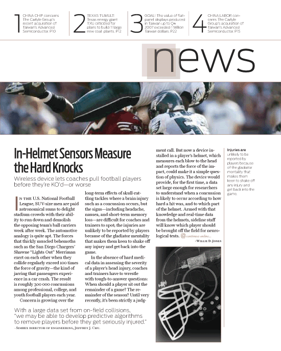
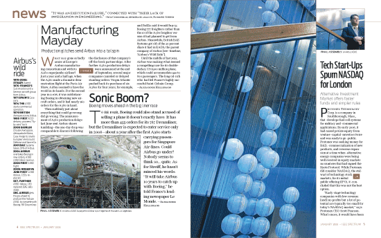
[ny] designlab: graphic design
client: IEEE Spectrum Magazine
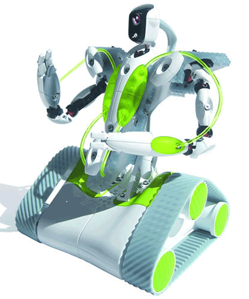
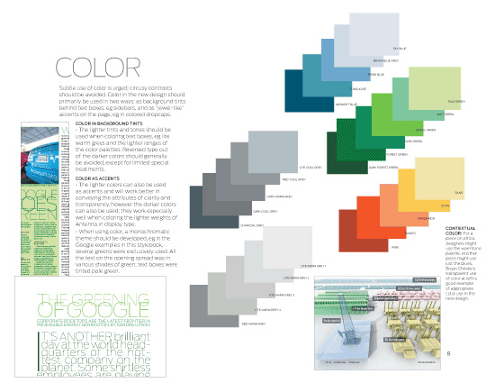
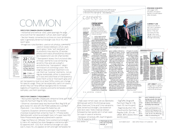
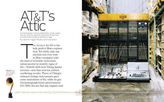
[Designer’s comment] Spectrum is the forum for IEEE: the Institute of Electrical and Electronics Engineers, the world’s largest technical professional society, founded in 1884 by a group that included Thomas Edison and Alexander Graham Bell and today is "dedicated to advancing innovation and technological excellence for the benefit of humanity." Our initial brief showed the magazine design had become outdated (see old design below left) and didn't properly reflect the organization's brand. Our goal was to create a more modern design that felt as innovative and sophisticated as its readers; also to give it a more futuristic look. One of the guiding priciples was transparency or a glass-like appearance. Working closely with the magazine's editors, art directors and staff, we developed dozens of initial sketches from which several basic directions were chosen to flesh out; one of which was chosen to develop into the final design (above). After the design was fine-tuned, production templates were designed in Adobe InDesign, including all styles and object libraries, ready for magazine production and shipping. A style book and "designer's toolbox" were created to guide current and future production and design efforts, and client was guided through the process of font licensing for the necessary new fonts used in the design. Part of the design effort was to establish certain imagery and art direction standards for the new look; Bryan Christie was selected as a primary source and guide for Information Graphics (see example at right, third from top). Following initial design phase, a prototype or all likely pages was created using actual copy, text and imagery. Finally, the actual first launch issue was created using the new templates and live copy for that issue. Our designers worked with the Spectrum team to begin the launch issue and then hand-off final production to the them. Subsequent issues were also given guidance to keep the new design on track and solve additional fine-tuning issues as they arose. This project was designed by John Schmitz and Christiaan Kuypers for Research Studios NY. [TYPOGRAPHY] This project was one of the earliest showcases for Font Bureau's Antenna, which was used in the logo and as the primary display font; the text and secondary display font was also a new font created for news usage called Farnham. [TECH NOTE] The logo was based on Antenna but was modified to accomodate different usages for web and print as well as small, medium and large size resolutions. Templates were prepared in Adobe InDesign.
[related work] IEEE Spectrum logo design