[ny] designlab: logo design
client: Procter and Gamble Pantene
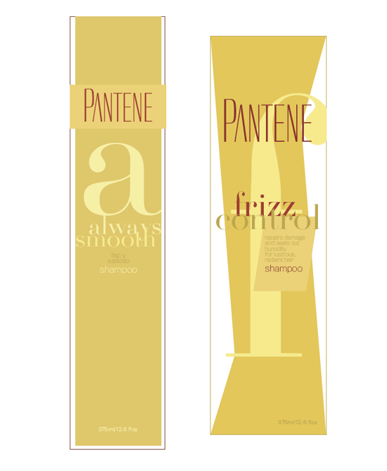
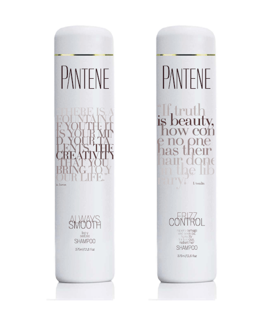
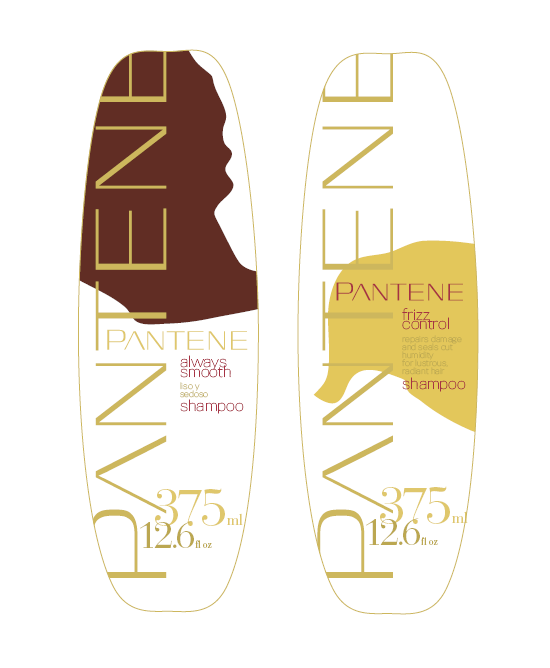
[designer’s comment] These logo sketches were developed by NYDL designer John Schmitz as part of a partner Research Studios marketing design project for Procter and Gamble's Pantene shampoo packaging redesign. A large client team had spent months working on a deep understanding of where their their brand and their target consumer was evolving, had engaged a major “big box” branding firm to lead the redesign, and were frustrated by the lack of innovative ideas coming from that large firm. So they asked us for some “disruptive thinking” that might help spur the project to where they wanted to go. In the end these were not used however elements of these ideas were eventually seen in some versions of the Pantene product. The flower images were all hand-drawn. [typography] The type is a radically redrawn version of Titling Gothic—essentially giving it more “thick/thin” shape, but without the expected serifs in such a design. The goal is a super-elegant, luxe look. A second wide version was tried as well as the very narrow version. Firmin Didot is also seen in some of the designs.