[ny] designlab: logo design
client: SUNY Learning Network
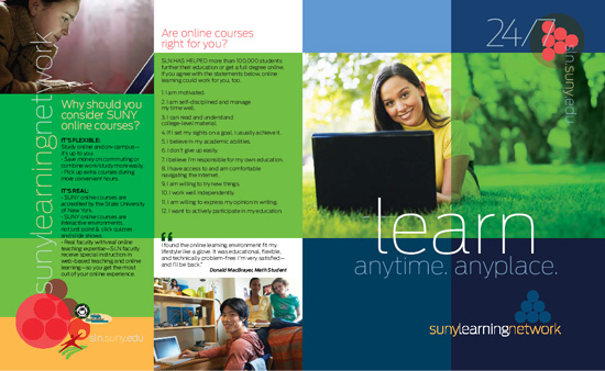
[designer’s comment] This branding makeover and new logo design was started a large marketing design project for SUNY Learning Network that included poster design along with stasunyrd marketing design pieces like print advertising, brochure, postcards and web site. The new brand was developed to help make the brand image match the organization—a cutting edge project from SUNY to bring higher education online. The old logo (elements, below) is dated looking and impractical for online or sny small usage. The new branding system and logo design have a modern look and a stronger color palette that reflects the wide range of students at SUNY. A key idea of this branding system is the idea of flexibility—the type and symbols are part of a tool box that can be colored and “floated” in various ways throughout the design of any given piece. In the same way, colors from the palette can be applied in different ways depending on the application. In more advanced usage, transparency can be used creating a blending of certain colors—this was used both in print and online at the website. A strong grid is also part of the overall brand design, complementing the logo design and making it richer. A complete styleguide was delivered to guide the client team in correct usage. [typography] The primary display font used is Antenna—often the distinctive Thin or for smaller usage the Extralight. Online Verdana was used for text; Antenna was used as the text font in print
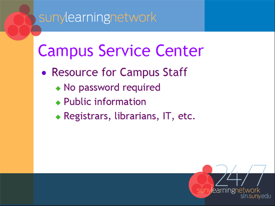
[related work] SUNY Learning Network web design