[ny] designlab: logo design
client: ieee spectrum
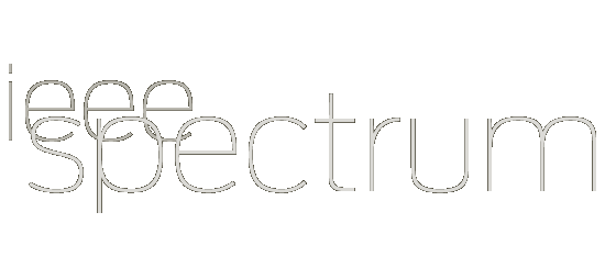
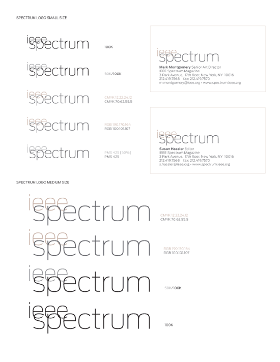
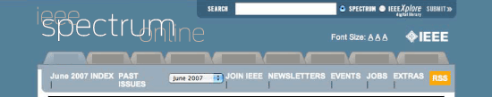
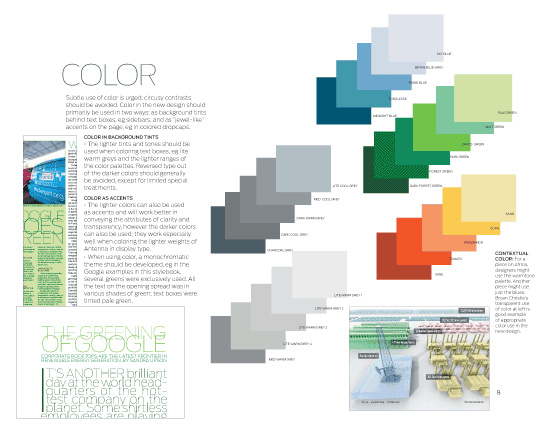
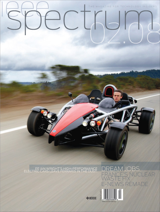
[designer’s comment] This branding makeover and new logo design evolved out of design explorations during a redesign of IEEE Spectrum, the magazine for the distinguished organization International Engineering & Electronics Engineers. During those explorations, many additional logo design treatments were tried (see related work below), but when this final look was tried it jumped out as perfect for the organization, which is known for its vision and technical sophistication. (Thomas Edison was one of the founders.) Part of the aim for the magazine design was a sort of glass-like clarity or transparency, with which this ultrathin and open font Antenna worked.[tech note] After the basic design was settled, additional sizes were drawn—with each smaller size being customized with an extra weight not available in the standard font weights of the family—this was especially critical for the online version, seen here also. Color palettes were also established for use in various print applications—including PMS and RGB as well as CMYK color formats. A stylebook was delivered to make easy future applications of the logo and branding system. [typography] The primary font used is Antenna Thin.
[related work] Spectrum magazine redesign